We live in a world where visuals rule. A well-designed, thoughtfully selected image can communicate more in an instant than words ever could. That’s why, in the realm of blogs and online content, the featured image is critical. It’s the cover of your book, the window display of your store — it demands attention, intrigues readers and convinces them to explore further. This blog post will explore the concept of the featured image, its importance, the best sizes for it, and finally give you ten outstanding designs which will undoubtedly grab your audience’s attention.
What is a Featured Image?
A featured image, at its core, is the primary image that represents your blog post or content. This could be a photo, an illustration, or even a graphic. Most of the time, it features the title of the post or conveys the essence of the content in a visual medium. This image serves as the preview snippet that entices readers to delve into your article or blog post.
Why Is a Featured Image So Important for Your Blog Post?
- Humans are Inherently Visual: People are biologically programmed to respond more actively to visual stimuli. We perceive and process images faster and more efficiently than text.
- Visual Appeal Increases Reader Engagement: The right images can draw people in, pique their interest, and increase their desire to read the content.
- Increased Exposure on Various Platforms: The featured image appears as the first element on your blog feed, archive page, at the top of your blog post, and with the link you share on social media platforms. Therefore, it’s an essential tool to gain more visibility and attract more readers.
Best Featured Image Sizes
The ideal sizes for a featured image usually follow a landscape orientation. This format tends to fit well on various platforms, particularly those that utilize ‘card’ style, such as Facebook or Twitter.
It’s also crucial to consider aspect ratios and precise dimensions. The most common aspect ratio are 1.91:1, or 16:9, used by many blogging platforms and social media sites. This translates into an image size of 1200×628, and 1200×675 pixels, which is ideal for providing a clear, concise visual that isn’t too large for quick loading times or too small to lose its impact.
10 Eye-Catching Featured Image Designs
Coming up next, we will provide you with 10 compelling featured image designs. These designs will cover a variety of styles, trends, and industries, aiming to inspire you and help you create impactful visuals for your blog posts.
1. Overlay
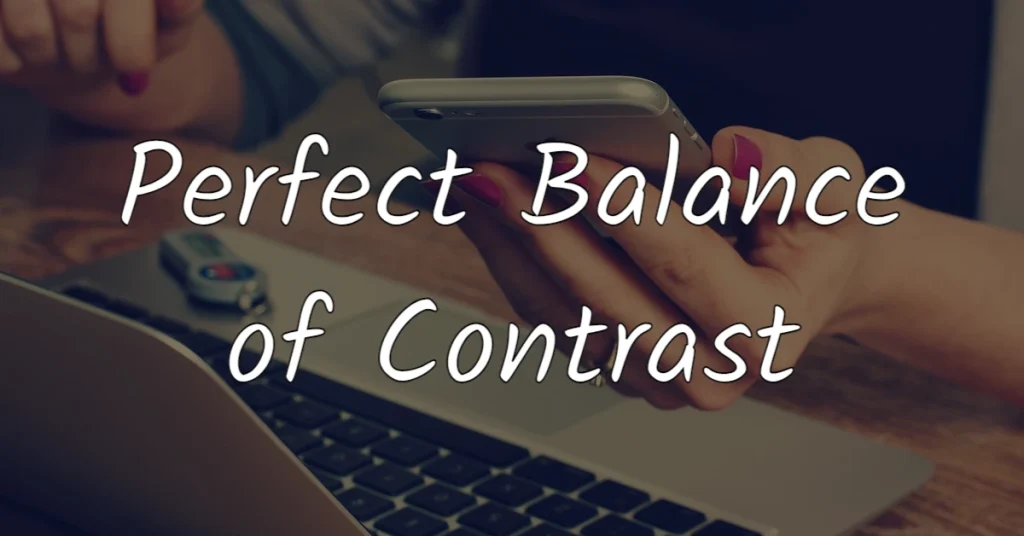
Overlay is a design technique that involves adding a layer of reduced-opacity color between your photo and text layers. This technique is a powerful tool for creating contrast, which makes your text pop and easier to read against the photo. Not only does it enhance readability, but it also works with almost all types of photos, adding a certain depth and visual interest to your design.
2. Half, Half
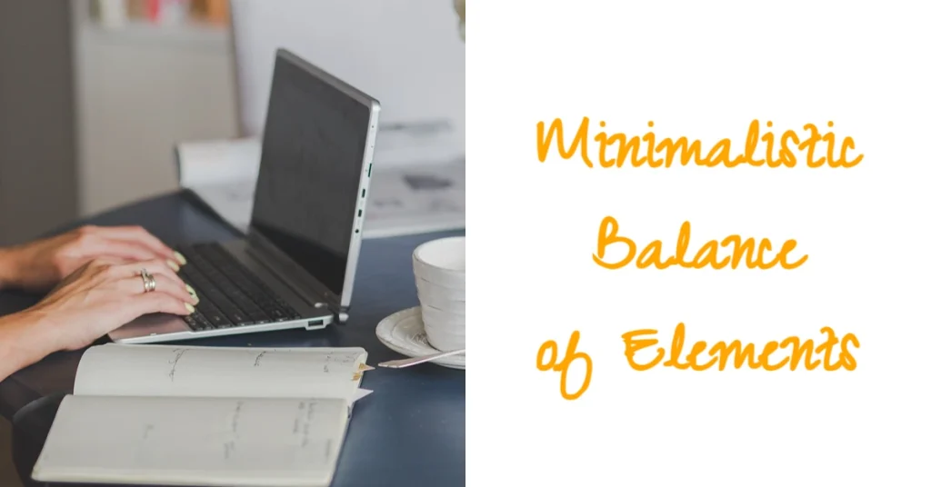
The half and half design is all about simplicity and balance. In this layout, you fill one half of your image with a high-quality photo and the other half with a block of color, which serves as the background for your text. The beauty of this design lies in its crisp, clean lines, uncluttered composition, and the striking balance between text and visuals.
3. Gradient
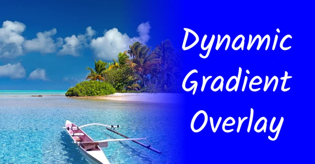
Similar to the half and half design, the gradient layout takes things a notch higher by adding more dynamism and visual appeal. This design technique allows your photo to stand out while ensuring that the title is still highly readable. The use of gradient is not just visually engaging, but it also brings in a sense of dimension and depth into the design.
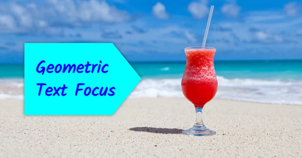
4. Text over Geometrical Shape
This approach involves placing your text inside a colored circular or rectangular frame set against a photo background. It can work wonderfully with a variety of photos, but it requires a keen eye for balance and composition. With this layout, you can make your text more noticeable and the overall design more captivating and unique.
5. Minimalistic
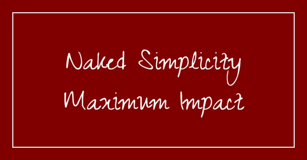
Sometimes, less is more. A minimalist design ditches the use of a photo and instead opts for a simple, colored background (possibly with a border or frame) paired with skillfully arranged text. The goal here is to draw attention to your message using simplicity and clarity as your primary design tools.
6. Text over Flat Image
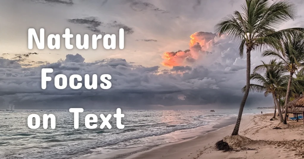
In this layout, you overlay your text on an area of your photo that doesn’t contain too many details or visual elements. This not only guarantees readability but also naturally guides the viewers’ eyes towards your text.
7. Vector graphics
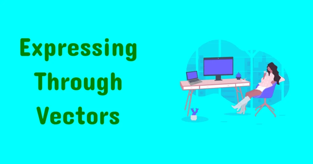
Vector graphics can add a modern and professional touch to your featured image. These can be tailored to resonate with the theme of your blog post effectively. Whether it’s an icon, a diagram, or an illustration, vector graphics can bring your content to life and make your title stand out.
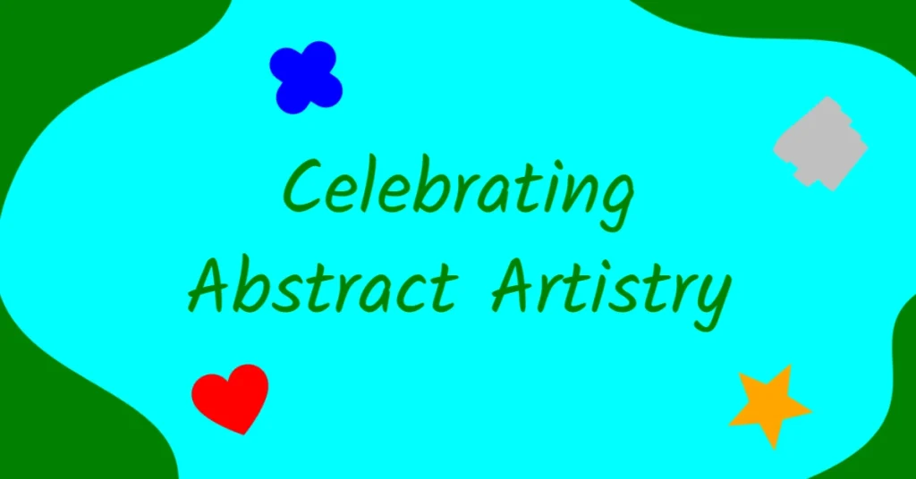
8. Abstract Background
An abstract background can give your blog post a unique and creative feel. The abstract design could be made up of patterns, textures, geometric shapes, or a mix of different art forms. When placing text over abstract backgrounds, ensure that it remains readable and that the abstract design resonates with your content.
9. Text on Horizontal Bar
This design technique requires placing a photo as a background and overlaying it with a horizontal bar bearing your text. Placing the bar on one of the horizontal thirds of your photo often yields an eye-catching design. The horizontal bar acts like a podium for your text, ensuring it gets the spotlight it deserves.

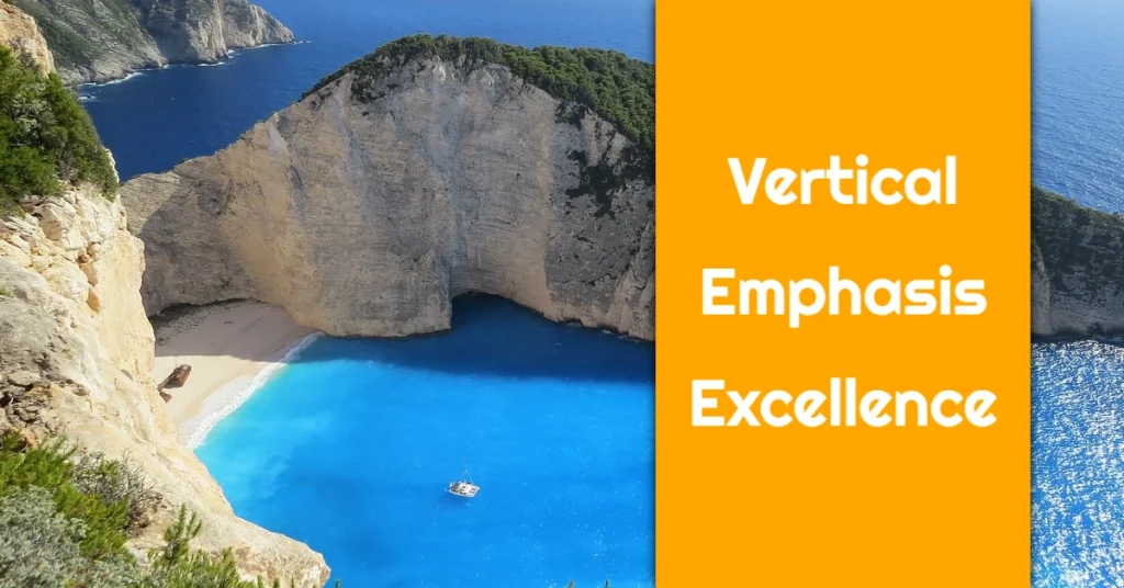
10. Text on Vertical Bar
Much like the previous technique, this layout involves placing a vertical bar over your photo and adding text to it. It creates an interesting visual alignment while ensuring that your title stands out. Remember to choose a contrasting color for your bar to maximize the impact.
Crafting the perfect featured image is part art, part science. It requires an understanding of visuals and how they impact the human brain, knowledge of timely design trends, and a touch of creativity. With this guide, you’re on the way to make your blog posts stand out and attract more reader engagement. Step up your featured image game and watch your readership grow!
